Here’s a cross-section of my work, dating back to the mid-eighties and Bill Smith Studio (BSS), where the main format was vinyl (funny how things go full circle), through to projects undertaken since going solo, back in 2008. You’ll mostly see the final design but there’s a couple of alternative, preferred layouts. There’s also several music projects that pre-date digital design and have been scanned from the original vinyl sleeves.
Please note: Hovering over many of the images will produce a brief project description and links to artist websites etc.
Feel free to get in touch via my Contact page or through Facebook or Bluesky if you have a project you’d like me to get involved in, or if you have a question or comment about the work.
 is available April 4 on various formats including gatefold vinyl and CD. Iconic cover photo: American actor Dennis Hopper after filming, \"The Last Movie\": Bruce Paulson/WWD/Penske Media via Getty Images. Info / pre-order here: https://sunrecords.lnk.to/LifeDeathDennisHopper")

![]()

![]()

.")
.")
![]()

.")
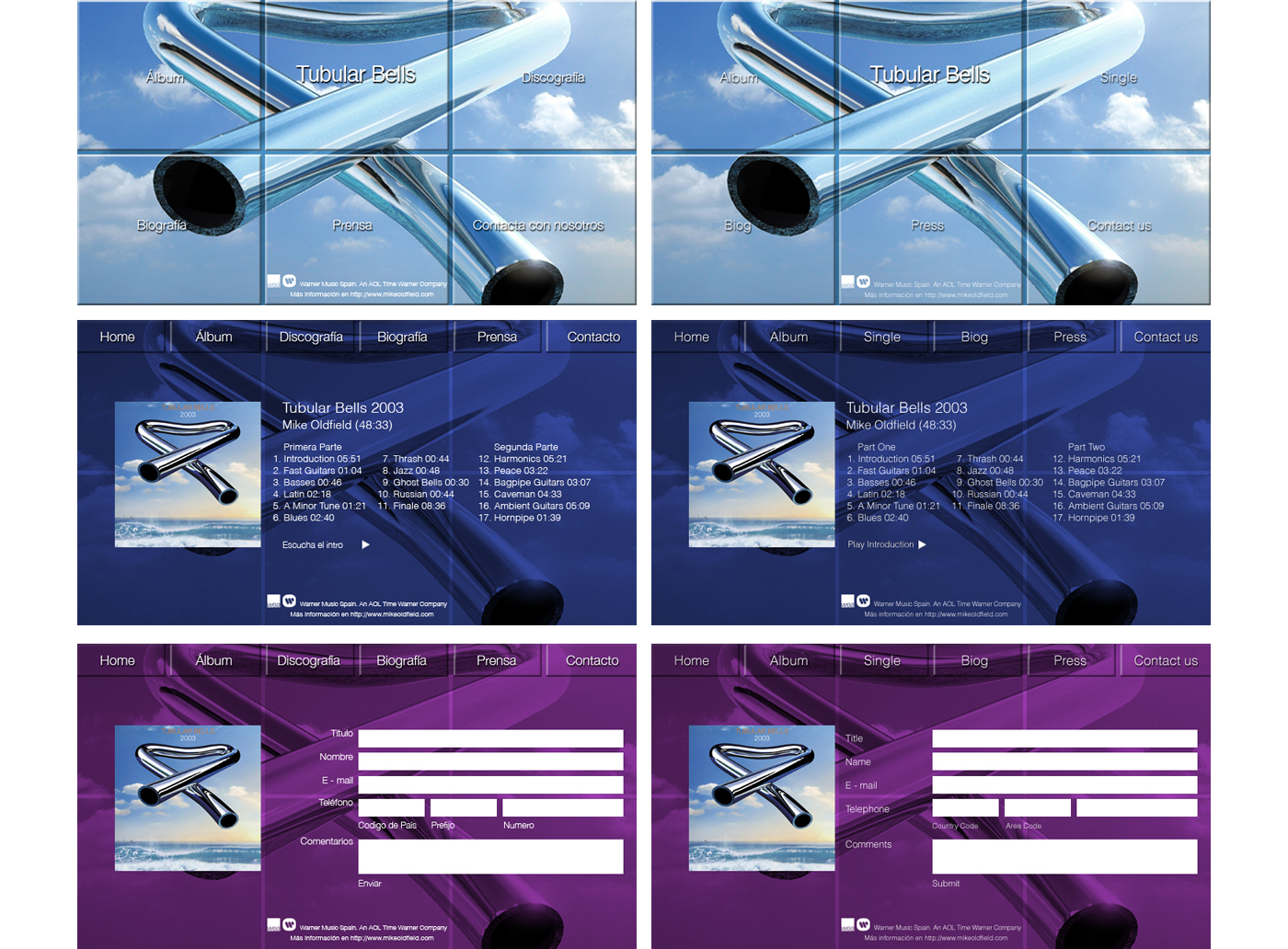
, The Jam, The Cure, Kate Bush, Led Zeppelin, The Rolling Stones, King Crimson, Paul Carrack & Mike Oldfield. I also contributed several stories. Order direct by clicking the image")


 and selecting Paul Carrack.")

![]()

![]()
![]()


Home
Posted by admin on 5 March 2025
Posted by admin on 5 March 2025


 collaboration with Clare, her husband and fellow band-member, Stephen for Cooking Vinyl..")

.")

.")


. It was very much a collaborative process between artist and studio and a personal highlight of my time at BSS. We went on to work with Kate until the 1990 boxed set, ‘This Woman's Work’.")


 SWR Big Band's latest album, Don't Wait Too Long. Photography by Lena Semmelroggen.")


, Sunny (2001), She Lived Down The Street (2003), I Don't Want Your Love (I Need Your Love) (2008)")


.")

.")


 entire book project, 320 inner pages plus cover on the sculptor most famous for the statue of Winston Churchill in Parliament Square, London")

.")


, purely typographic-based cover designs.")


")


 design.")


